Modernizing the Front-End of a Legacy Website to Meet Today’s Standards
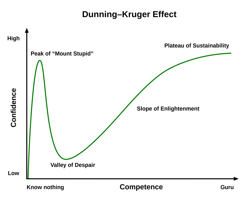
Me and a friend got into a project way back in 2010. We were not so experienced but as all not so experienced people we thought we knew it all. Speaking in Dunning-Kruger effect terms for myself, I think that I was in the slope of enlightenment phase, probably close to the middle of it.
After a year of hardcore development it was online and it became what is today known as vikitap.com.
The website was pretty popular at the beginning but with the move to the mobile devices it slowly lost its popularity. This process was visible to me during multiple years but I just didn’t have resources to spend to the issue. Throughout the years, whenever I found some time and motivation, I would go back to it and try to adapt it to today’s world.
First of all, here’s the front-end tech stack:
- HTML with custom CSS classes.
- Fixed width layout.
- JQuery with some additional jquery plugins.
- JQueryUI.
The custom CSS was really REALLY bad. There was no structure at all and inline CSS was all over the place in random places. CSS frameworks were not even popular back then or possibly they didn’t even exist. Twitters Bootstrap came out in August 19, 2011 so we were unlucky there. I remember I attempted to create a set of CSS classes to be reused within the project but in the end it was a failed attempt. I just didn’t have enough patience and ended up writing inline CSS whenever I felt like it. All this caused the website to look wrong. There was no consistency in the look and feel.
The quick solution to this was to move to a CSS framework. I chose W3.css and updated the UI with W3.css classes. I wanted the simplest solution and I thought it would be faster to implement. I didn’t want to spend too much time on researching different frameworks and at the time W3.css looked simpler to me than other frameworks. I think it does a good job and it worked really well on both desktop and mobile.
Another big issue was the fixed width layout that was really popular somewhere between 2005-2010. Back then, the only thing where you could view a website was a desktop PC. So the website UI development was looking to a single statistic: What is the most used screen resolution? I don’t remember the most popular screen resolution back then but when we started to develop the site the golden standard for the width of a website was 980px. So that’s what we did. We couldn’t foresee that mobile devices would change everything really soon.
Fortunately W3.css helped with the responsiveness issue too. I got two birds with one stone.
After the migration to the new UI and some performance tweaks to the backend for a faster website, I was expecting some big improvements with the google search results. To my surprise, nothing changed and the site was still going down. At this point, I had to take a break from working on it for a couple of years because I was too busy with life and work.
These days, I started the working process again and I’ve been consistently working on it for two months or so, couple of days every week.
From google search console, I see that my mobile experience still sucks and that I have to fix even more things for a better mobile experience:
PageSpeed Insights
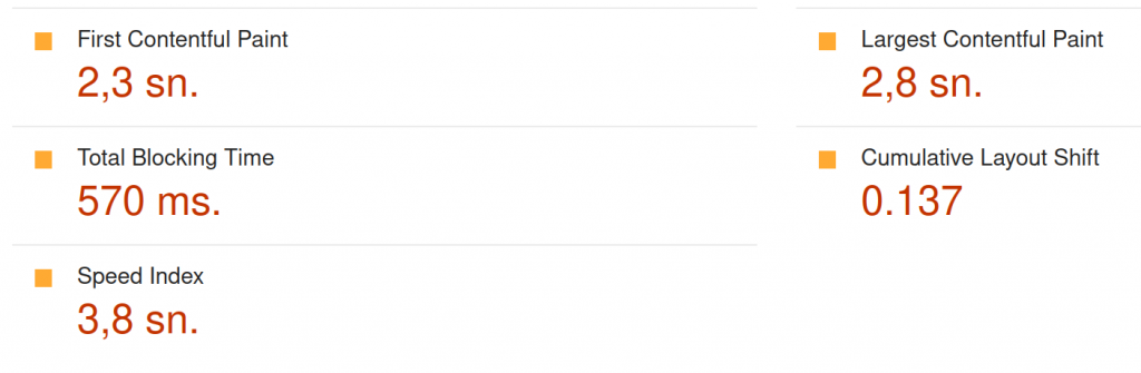
The above image is the result for this link. As you can see, it’s all red. Even though the desktop experience is close to perfect, the mobile experience is the worst. It turns out now we have to really really minify the usage of everything. It’s not just about merging all your CSS and JS together and having a big single file for them. You have to extract your crucial CSS and put it in the HTML as inline CSS for the best mobile experience because downloading a big CSS file blocks the rendering of your page thus increasing your “Total Blocking Time” while it makes you site look miserable in slow mobile devices with slow internet connections.
In addition to the CSS file improvements there are other things like:
“Cumulative Layout Shift” which means you have to specify the width and height of your images in the html code instead of just waiting for them to load because it will make the UI shift while the user waits for it to load.
“First Contentful Paint” which is the time it takes for the browser to render the first bit of content on the screen. A speedy FCP results in a website that appears quick and highly responsive, ultimately leading to a reduced bounce rate.
It’s very interesting to see that all these things make people stay or leave your website on a mobile device, subconsciously everyone prefers a smoother experience and that’s part of how we are hardwired as human beings. I have to thank everyone who’s sorting these problems and sharing their findings with the world to help us improve. Now it’s time to work more and get results. I’m hoping to share good results in another post in the future.
Leave a Reply